Suggested Video Tutorials
Part 17 - Bootstrap dropdown
Part 18 - Bootstrap button group
Part 19 - Bootstrap split button dropdown
In this video we will discuss the 3 form layouts provided by Bootstrap
Bootstrap provides the following 3 form layouts
1. Vertical form (Default)
2. Horizontal form
3. Inline form
The followin are the classes that are used to style forms
form-group - Use this class on the <div> element that wraps labels and form controls for optimum spacing
form-control - Use this class on all textual elements (<input>, <textarea>, and <select>)
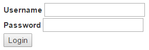
Example : In the HTML below we have 2 text boxes and a submit button
At the moment, we have not applied any of the Bootstrap form classes. If we view this page, in the browser this is how the form looks. Not very pretty.
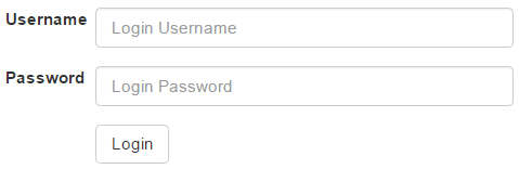
Creating a vertical form layout : This is the default form layout. In the vertical form layout, the label and it's associated form control are stacked. Creating a vertical bootstrap form is very simple.
1. Apply form-group class on the <div> element that wraps the label and the textbox
2. Apply form-control class on the textbox

Creating an inline form layout : Inline form layout places the form controls side by side. To create an inline form layout, all you have to do is apply form-inline class on the <form> element.

Please note : You get the inline form layout only if the viewport is at least 768px wide. If the viewport width falls below 768px, the form layout reverts to vertical.
Creating horizontal form layout : In the horizontal form layout, the label is on the left and it's associated form control is on the right in a single line. To create a horizontal form layout
1. Use the form-horizontal class on the <form> element
2. Use the control-label class on the <label> element
3. Use Bootstrap's grid classes to align labels and form controls
Please note : With this example, we will only have the horizontal form layout on a large, medium, and small screen sizes. On an extra small screen size, like a mobile phone, the form reverts to a vertical layout. If you want the horizontal layout on all screen sizes, including an extra small screen size, use col-xs-* grid classes instead of col-sm-* classes.

Part 17 - Bootstrap dropdown
Part 18 - Bootstrap button group
Part 19 - Bootstrap split button dropdown
In this video we will discuss the 3 form layouts provided by Bootstrap
Bootstrap provides the following 3 form layouts
1. Vertical form (Default)
2. Horizontal form
3. Inline form
The followin are the classes that are used to style forms
form-group - Use this class on the <div> element that wraps labels and form controls for optimum spacing
form-control - Use this class on all textual elements (<input>, <textarea>, and <select>)
Example : In the HTML below we have 2 text boxes and a submit button
<form>
<div>
<label for="inputUserName">Username</label>
<input type="text" id="inputUserName" />
</div>
<div>
<label for="inputPassword">Password</label>
<input type="password" id="inputPassword" />
</div>
<button type="submit">Login</button>
</form>
At the moment, we have not applied any of the Bootstrap form classes. If we view this page, in the browser this is how the form looks. Not very pretty.
Creating a vertical form layout : This is the default form layout. In the vertical form layout, the label and it's associated form control are stacked. Creating a vertical bootstrap form is very simple.
1. Apply form-group class on the <div> element that wraps the label and the textbox
2. Apply form-control class on the textbox
<form>
<div class="form-group">
<label for="inputUserName">Username</label>
<input class="form-control" placeholder="Login Username"
type="text" id="inputUserName" />
</div>
<div class="form-group">
<label for="inputPassword">Password</label>
<input class="form-control" placeholder="Login Password"
type="password" id="inputPassword" />
</div>
<button type="submit" class="btn btn-default">Login</button>
</form>
Creating an inline form layout : Inline form layout places the form controls side by side. To create an inline form layout, all you have to do is apply form-inline class on the <form> element.
<form class="form-inline">
<div class="form-group">
<label for="inputUserName">Username</label>
<input class="form-control" placeholder="Login Username"
type="text" id="inputUserName" />
</div>
<div class="form-group">
<label for="inputPassword">Password</label>
<input class="form-control" placeholder="Login Password"
type="password" id="inputPassword" />
</div>
<button type="submit" class="btn btn-default">Login</button>
</form>
Please note : You get the inline form layout only if the viewport is at least 768px wide. If the viewport width falls below 768px, the form layout reverts to vertical.
Creating horizontal form layout : In the horizontal form layout, the label is on the left and it's associated form control is on the right in a single line. To create a horizontal form layout
1. Use the form-horizontal class on the <form> element
2. Use the control-label class on the <label> element
3. Use Bootstrap's grid classes to align labels and form controls
<form class="form-horizontal">
<div class="form-group">
<label for="inputUserName" class="control-label col-sm-2">Username</label>
<div class="col-sm-10">
<input class="form-control" placeholder="Login Username"
type="text" id="inputUserName" />
</div>
</div>
<div class="form-group">
<label for="inputPassword" class="control-label col-sm-2">Password</label>
<div class="col-sm-10">
<input class="form-control" placeholder="Login Password"
type="password" id="inputPassword" />
</div>
</div>
<div class="form-group">
<div class="col-sm-offset-2
col-sm-10">
<button type="submit" class="btn btn-default">Login</button>
</div>
</div>
</form>
Please note : With this example, we will only have the horizontal form layout on a large, medium, and small screen sizes. On an extra small screen size, like a mobile phone, the form reverts to a vertical layout. If you want the horizontal layout on all screen sizes, including an extra small screen size, use col-xs-* grid classes instead of col-sm-* classes.
Please make tutorials on android and Java
ReplyDeleteThe world is still beautiful because of some people like you
ReplyDeleteLove the tutorials - but I'm not able to get the form-horizontal example working. I've gone so far as to copy/paste your example into my page but it still seems to be using the vertical layout.
ReplyDeletei have done with the form-horizontal
DeleteMike Storey,I have done with the form-horizontal.Kindly try once more might be you missed something.Cross check your code and try again
ReplyDelete.