Suggested Video Tutorials
Part 14 - Bootstrap table classes
Part 15 - Bootstrap button classes
Part 16 - Bootstrap icons
In this video, we will discuss creating a dropdown menu using bootstrap
Creating bootstrap hyperlink dropdown
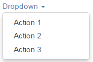
Here is the HTML required
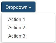
Creating bootstrap button dropdown

To create a dropdown with a button as the trigger element, replace the anchor element with a button element as shown below.
Applying bootstrap button classes (btn & btn-primary) on the button element will style the dropdown button as shown below.
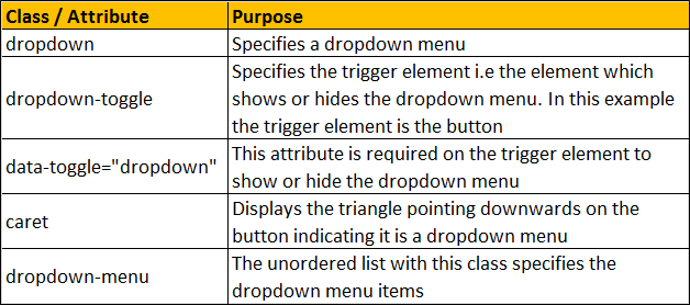
Dropdown menu header
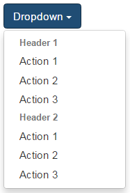
To add a header to the dropdown menu, use dropdown-header class on an <li> element
Dropdown menu divider
To add a divider between the dropdown menu items, use divider class on an <li> element
Disabled dropdown menu item
To disable a menu item, use the disabled class
If you want the dropdown menus to expand upwards, nest the dropdown markup in a <div> element with class dropup as shown below.
Here is the HTML

Part 14 - Bootstrap table classes
Part 15 - Bootstrap button classes
Part 16 - Bootstrap icons
In this video, we will discuss creating a dropdown menu using bootstrap
Creating bootstrap hyperlink dropdown
Here is the HTML required
<div class="dropdown">
<a data-toggle="dropdown" class="dropdown-toggle">
Dropdown
<span class="caret"></span>
</a>
<ul class="dropdown-menu">
<li><a href="#">Action 1</a></li>
<li><a href="#">Action 2</a></li>
<li><a href="#">Action 3</a></li>
</ul>
</div>
Creating bootstrap button dropdown
To create a dropdown with a button as the trigger element, replace the anchor element with a button element as shown below.
<div class="dropdown">
<button data-toggle="dropdown" class="dropdown-toggle">
Dropdown
<span class="caret"></span>
</button>
<ul class="dropdown-menu">
<li><a href="#">Action 1</a></li>
<li><a href="#">Action 2</a></li>
<li><a href="#">Action 3</a></li>
</ul>
</div>
Applying bootstrap button classes (btn & btn-primary) on the button element will style the dropdown button as shown below.
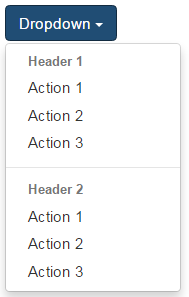
Dropdown menu header
To add a header to the dropdown menu, use dropdown-header class on an <li> element
<div class="dropdown">
<button data-toggle="dropdown" class="btn btn-primary dropdown-toggle">
Dropdown
<span class="caret"></span>
</button>
<ul class="dropdown-menu">
<li class="dropdown-header"><strong>Header 1</strong></li>
<li><a href="#">Action 1</a></li>
<li><a href="#">Action 2</a></li>
<li><a href="#">Action 3</a></li>
<li class="dropdown-header"><strong>Header 2</strong></li>
<li><a href="#">Action 1</a></li>
<li><a href="#">Action 2</a></li>
<li><a href="#">Action 3</a></li>
</ul>
</div>
Dropdown menu divider
To add a divider between the dropdown menu items, use divider class on an <li> element
<div class="dropdown">
<button data-toggle="dropdown" class="btn btn-primary dropdown-toggle">
Dropdown
<span class="caret"></span>
</button>
<ul class="dropdown-menu">
<li class="dropdown-header"><strong>Header 1</strong></li>
<li><a href="#">Action 1</a></li>
<li><a href="#">Action 2</a></li>
<li><a href="#">Action 3</a></li>
<li class="divider"></li>
<li class="dropdown-header"><strong>Header 2</strong></li>
<li><a href="#">Action 1</a></li>
<li><a href="#">Action 2</a></li>
<li><a href="#">Action 3</a></li>
</ul>
</div>
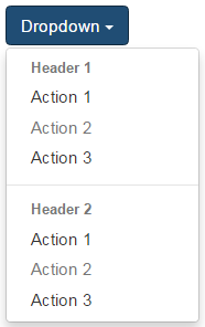
Disabled dropdown menu item
To disable a menu item, use the disabled class
<div class="dropdown">
<button data-toggle="dropdown" class="btn btn-primary dropdown-toggle">
Dropdown
<span class="caret"></span>
</button>
<ul class="dropdown-menu">
<li class="dropdown-header"><strong>Header 1</strong></li>
<li><a href="#">Action 1</a></li>
<li class="disabled"><a href="#">Action 2</a></li>
<li><a href="#">Action 3</a></li>
<li class="divider"></li>
<li class="dropdown-header"><strong>Header 2</strong></li>
<li><a href="#">Action 1</a></li>
<li class="disabled"><a href="#">Action 2</a></li>
<li><a href="#">Action 3</a></li>
</ul>
</div>
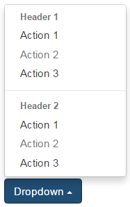
If you want the dropdown menus to expand upwards, nest the dropdown markup in a <div> element with class dropup as shown below.
Here is the HTML
<div class="dropup">
<div class="dropdown">
<button data-toggle="dropdown" class="btn btn-primary dropdown-toggle">
Dropdown
<span class="caret"></span>
</button>
<ul class="dropdown-menu">
<li class="dropdown-header"><strong>Header 1</strong></li>
<li><a href="#">Action 1</a></li>
<li class="disabled"><a href="#">Action 2</a></li>
<li><a href="#">Action 3</a></li>
<li class="divider"></li>
<li class="dropdown-header"><strong>Header 2</strong></li>
<li><a href="#">Action 1</a></li>
<li class="disabled"><a href="#">Action 2</a></li>
<li><a href="#">Action 3</a></li>
</ul>
</div>
</div>
HI Would you please give a video tutorial on how to create searchable multi select drop down.
ReplyDeleteAnd it also helps if you can give video tutorial on how to create custom directives.
Hi , Since I have muliple content in my drop down menu, I would like to crate a scrollable drop down option. Could you please share the example
ReplyDeletepre-scrollable class will do the trick
DeleteHow to have a default value already set in dropdown.
ReplyDelete