Suggested Video Tutorials
Part 11 - Bootstrap blockquotes and lists
Part 12 - Bootstrap list groups
Part 13 - Bootstrap code blocks
In this video we will discuss styling tables using bootstrap classes.
Bootstrap classes for styling tables

Contextual classes to color table rows or individual cells

Here is the HTML for the table without any boostrap table classes
Output :

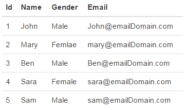
table class provides light padding and horizontal lines
Output :

table-striped class provides zebra-striping for the table rows
Output :

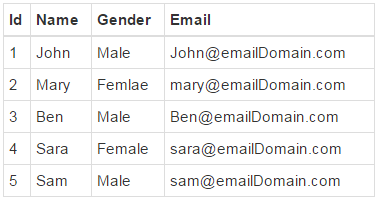
table-bordered class provide borders on all sides of the table and cells.
Output :

table-hover class provides highlighting of rows on hover
table-condensed class makes table more compact by cutting cell padding in half
Output :

To make a table responsive, place the table inside a <div> element, and apply table-responsive class on the <div> element. This will provide a horizontal scrollbar when the screen size is less than 768px (i.e on a small device). On a screen size larger than 768px you will not find any difference. Applying the table-responsive class directly on the table will not do anything useful.
Output :

Use the bootstrap contextual classes to colour the table rows
Output :


Part 11 - Bootstrap blockquotes and lists
Part 12 - Bootstrap list groups
Part 13 - Bootstrap code blocks
In this video we will discuss styling tables using bootstrap classes.
Bootstrap classes for styling tables

Contextual classes to color table rows or individual cells

Here is the HTML for the table without any boostrap table classes
<table>
<thead>
<tr>
<th>Id</th>
<th>Name</th>
<th>Gender</th>
<th>Email</th>
</tr>
</thead>
<tbody>
<tr>
<td>1</td>
<td>John</td>
<td>Male</td>
<td>John@emailDomain.com</td>
</tr>
<tr>
<td>2</td>
<td>Mary</td>
<td>Femlae</td>
<td>mary@emailDomain.com</td>
</tr>
<tr>
<td>3</td>
<td>Ben</td>
<td>Male</td>
<td>Ben@emailDomain.com</td>
</tr>
<tr>
<td>4</td>
<td>Sara</td>
<td>Female</td>
<td>sara@emailDomain.com</td>
</tr>
<tr>
<td>5</td>
<td>Sam</td>
<td>Male</td>
<td>sam@emailDomain.com</td>
</tr>
</tbody>
</table>
Output :

table class provides light padding and horizontal lines
<table class="table">
<!--rest
of the HTML stays the same-->
</table>
Output :

table-striped class provides zebra-striping for the table rows
<table class="table
table-striped">
<!--rest
of the HTML stays the same-->
</table>
Output :

table-bordered class provide borders on all sides of the table and cells.
<table class="table
table-striped table-bordered">
<!--rest
of the HTML stays the same-->
</table>
Output :

table-hover class provides highlighting of rows on hover
<table class="table
table-bordered table-hover">
<!--rest
of the HTML stays the same-->
</table>
table-condensed class makes table more compact by cutting cell padding in half
<table class="table
table-bordered table-hover table-condensed">
<!--rest
of the HTML stays the same-->
</table>
Output :

To make a table responsive, place the table inside a <div> element, and apply table-responsive class on the <div> element. This will provide a horizontal scrollbar when the screen size is less than 768px (i.e on a small device). On a screen size larger than 768px you will not find any difference. Applying the table-responsive class directly on the table will not do anything useful.
<div class="table-responsive">
<table class="table
table-bordered table-hover">
<!--rest
of the HTML stays the same-->
</table>
</div>
Output :

Use the bootstrap contextual classes to colour the table rows
<div class="table-responsive">
<table class="table
table-bordered table-hover">
<thead>
<tr>
<th>Id</th>
<th>Name</th>
<th>Gender</th>
<th>Email</th>
</tr>
</thead>
<tbody>
<tr class="active">
<td>1</td>
<td>John</td>
<td>Male</td>
<td>John@emailDomain.com</td>
</tr>
<tr class="danger">
<td>2</td>
<td>Mary</td>
<td>Femlae</td>
<td>mary@emailDomain.com</td>
</tr>
<tr class="info">
<td>3</td>
<td>Ben</td>
<td>Male</td>
<td>Ben@emailDomain.com</td>
</tr>
<tr class="success">
<td>4</td>
<td>Sara</td>
<td>Female</td>
<td>sara@emailDomain.com</td>
</tr>
<tr class="warning">
<td>5</td>
<td>Sam</td>
<td>Male</td>
<td>sam@emailDomain.com</td>
</tr>
</tbody>
</table>
</div>
Output :


Hi Venkat,
ReplyDeleteYour video tutorial was so good to learn.
Hence, I request you to upload Angular JS 2.0 tutorial.
Hi sir,
ReplyDeletehow to fetch data from database and show in bootstrap table
Hello this is my first ever commenting on any blog.. You Just earn it. Earlier I lost your web site address.. Makes me so sed :( I had to visit youtube searching "bootstrap grid system" and after a long check I found your site again:). BTW, keep going your best work... and share if any thing new found about bootstrap..
ReplyDelete