Suggested Video Tutorials
Part 30 - Bootstrap pager and pagination
Part 31 - Bootstrap panels
Part 32 - Bootstrap well
In this video we will discuss Bootstrap labels and badges components.
The label component is useful for providing important additional information. For example, we can use labels to let the user know whether if a course is new or if it is beginner, intermediate or advanced level.

Contextual state classes : In the example above we have used label-default class, which applied default contextual styling to the label. The following contextual state classes can also be used.
label-primary
label-success
label-info
label-warning
label-danger

All headings <h1> through <h6> can be used with bootstrap label component
The badge component is useful for providing important notifications like number of new messages in your email inbox.

Using badge component with buttons : The badge component can also be used with other elements such as a button. When used with the button, the badge component has the capability to adapt to the contextual state class used on the button.


Part 30 - Bootstrap pager and pagination
Part 31 - Bootstrap panels
Part 32 - Bootstrap well
In this video we will discuss Bootstrap labels and badges components.
The label component is useful for providing important additional information. For example, we can use labels to let the user know whether if a course is new or if it is beginner, intermediate or advanced level.
<div class="well">
<h3>Dot Net Courses from PragimTech</h3>
<hr />
<h4>C# <span class="label
label-default">Beginner</span></h4>
<h4>ASP.NET <span class="label
label-default">Beginner</span></h4>
<h4>ADO.NET <span class="label
label-default">Intermediate</span></h4>
<h4>WCF <span class="label
label-default">Advanced</span></h4>
<h4>Bootstrap <span class="label
label-default">New</span></h4>
</div>
Contextual state classes : In the example above we have used label-default class, which applied default contextual styling to the label. The following contextual state classes can also be used.
label-primary
label-success
label-info
label-warning
label-danger
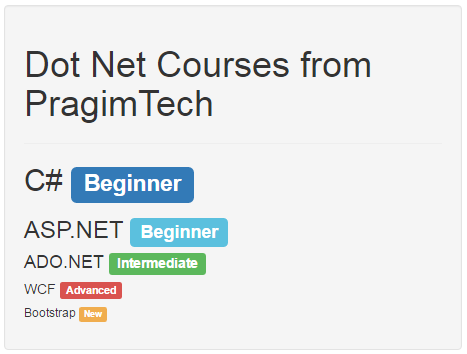
<div class="well">
<h3>Dot Net Courses from PragimTech</h3>
<hr />
<h4>C# <span class="label
label-primary">Beginner</span></h4>
<h4>ASP.NET <span class="label
label-info">Beginner</span></h4>
<h4>ADO.NET <span class="label
label-success">Intermediate</span></h4>
<h4>WCF <span class="label
label-danger">Advanced</span></h4>
<h4>Bootstrap <span class="label
label-warning">New</span></h4>
</div>
All headings <h1> through <h6> can be used with bootstrap label component
<div class="well">
<h1>Dot Net Courses from PragimTech</h1>
<hr />
<h2>C# <span class="label
label-primary">Beginner</span></h2>
<h3>ASP.NET <span class="label
label-info">Beginner</span></h3>
<h4>ADO.NET <span class="label
label-success">Intermediate</span></h4>
<h5>WCF <span class="label
label-danger">Advanced</span></h5>
<h6>Bootstrap <span class="label
label-warning">New</span></h6>
</div>
The badge component is useful for providing important notifications like number of new messages in your email inbox.
<a href="#">Inbox <span class="badge">10</span></a><br />
<a href="#">Sent <span class="badge">2</span></a><br />
<a href="#">Spam <span class="badge">3</span></a><br />
<a href="#">Trash <span class="badge">5</span></a>
Using badge component with buttons : The badge component can also be used with other elements such as a button. When used with the button, the badge component has the capability to adapt to the contextual state class used on the button.
<button class="btn
btn-primary">Inbox <span class="badge">10</span></button>
<button class="btn
btn-warning">Sent <span class="badge">2</span></button>
<button class="btn
btn-success">Spam <span class="badge">3</span></button>
<button class="btn btn-info">Trash <span class="badge">5</span></button>
No comments:
Post a Comment
It would be great if you can help share these free resources