Suggested Video Tutorials
Part 1 - What is bootstrap
Part 2 - Setting up bootstrap
In this video we will discuss, How to create page layouts using bootstrap grid system.
One of the very important concept that we need to understand in Bootstrap is it's Grid System. The Grid system is used for creating page layouts through a series of rows and columns. The Grid System consists of 12 columns. This grid system is so flexible that you can create any page layout that you want.

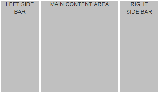
Let us now see how to create a 3 column layout using the Bootstrap Grid System. The 3 column layout should be as shown below.

The page should be divided into 3 columns with 1:4:1 ratio. One important thing to keep in mind here is that, if we add the 3 numbers in the ratio (1:4:1), the sum should be equal to 12, because the bootstrap grid system consists of 12 columns. This means if the LEFT SIDE BAR column is 2 units, the MAIN CONTENT AREA column should be 8 units and the RIGHT SIDE BAR column should be 2 units. So when we add these 3 numbers (2 Units + 8 Units + 2 Units), we get 12 units.
Bootstrap includes several grid classes for creating layouts for different devices like mobile phones, tablets, laptops, desktops, etc. The table below shows the available bootstrap grid classes that you can use to create grid column layouts ranging from extra small devices like mobile phones to large devices like large desktop screens.

We will discuss these different classes in detail with examples in a later video. For now let's use .col-md-* class to create a 3 column layout.
There are 3 simple steps to create the 3 column layout that we want, using the bootstrap 12 column grid system
1. First, create a container. We do this by creating a <div> element using the bootstrap .container class. All the rows will be within this container.
2. Second, create a row within the container. We do this by creating a <div> element using the bootstrap .row class.
3. Finally within the row we create the 3 columns that we need. We do this by creating <div> elements using any of the bootstrap grid classes (.col-xs-*, .col-sm-*, .col-md-* & .col-lg-*). In this example we are using col-xs-* class.
Please note that here I am also using a custom class (.customDiv) to apply some custom styles to each of the div elements.
Here is the definition of the custom css class (.customDiv)
I have created this class in a stylesheet that I named CustomStyles.css. I have placed this in the root folder of the project.
Here is the complete HTML of index.html
Some important points to keep in mind when working with the bootstrap grid system to create page layouts
1. Rows must be placed within a container for proper alignment and padding.
2. Use rows to create horizontal groups of columns.
3. Content should be placed within columns, and only columns may be immediate children of rows.
4. If more than 12 columns are placed within a single row, each group of extra columns will, as one unit, wrap onto a new line.
5. Grid columns are created by specifying the number of twelve available columns you wish to span. For example, to create four equal columns we would use four .col-xs-3.
To create 4 equal columns i.e with 1:1:1:1 ratio, we would use the following HTML
To create 4 columns with 1:2:2:1 ratio, we would use the following HTML

Part 1 - What is bootstrap
Part 2 - Setting up bootstrap
In this video we will discuss, How to create page layouts using bootstrap grid system.
One of the very important concept that we need to understand in Bootstrap is it's Grid System. The Grid system is used for creating page layouts through a series of rows and columns. The Grid System consists of 12 columns. This grid system is so flexible that you can create any page layout that you want.

Let us now see how to create a 3 column layout using the Bootstrap Grid System. The 3 column layout should be as shown below.

The page should be divided into 3 columns with 1:4:1 ratio. One important thing to keep in mind here is that, if we add the 3 numbers in the ratio (1:4:1), the sum should be equal to 12, because the bootstrap grid system consists of 12 columns. This means if the LEFT SIDE BAR column is 2 units, the MAIN CONTENT AREA column should be 8 units and the RIGHT SIDE BAR column should be 2 units. So when we add these 3 numbers (2 Units + 8 Units + 2 Units), we get 12 units.
Bootstrap includes several grid classes for creating layouts for different devices like mobile phones, tablets, laptops, desktops, etc. The table below shows the available bootstrap grid classes that you can use to create grid column layouts ranging from extra small devices like mobile phones to large devices like large desktop screens.

We will discuss these different classes in detail with examples in a later video. For now let's use .col-md-* class to create a 3 column layout.
There are 3 simple steps to create the 3 column layout that we want, using the bootstrap 12 column grid system
1. First, create a container. We do this by creating a <div> element using the bootstrap .container class. All the rows will be within this container.
2. Second, create a row within the container. We do this by creating a <div> element using the bootstrap .row class.
3. Finally within the row we create the 3 columns that we need. We do this by creating <div> elements using any of the bootstrap grid classes (.col-xs-*, .col-sm-*, .col-md-* & .col-lg-*). In this example we are using col-xs-* class.
Please note that here I am also using a custom class (.customDiv) to apply some custom styles to each of the div elements.
<div class="container">
<div class="row">
<div class="col-md-2">
<div class="customDiv">LEFT SIDE BAR</div>
</div>
<div class="col-md-8">
<div class="customDiv">MAIN CONTENT AREA</div>
</div>
<div class="col-md-2">
<div class="customDiv">RIGHT SIDE BAR</div>
</div>
</div>
</div>
Here is the definition of the custom css class (.customDiv)
.customDiv{
margin:3px;
min-height:300px;
background-color:silver;
text-align:center;
font-size:large
}
I have created this class in a stylesheet that I named CustomStyles.css. I have placed this in the root folder of the project.
Here is the complete HTML of index.html
<!DOCTYPE html>
<html lang="en">
<head>
<meta charset="utf-8">
<meta http-equiv="X-UA-Compatible" content="IE=edge">
<meta name="viewport" content="width=device-width, initial-scale=1">
<title>Bootstrap Example</title>
<link href="bootstrap/css/bootstrap.min.css" rel="stylesheet">
<link href="CustomStyles.css" rel="stylesheet" />
</head>
<body>
<div class="container">
<div class="row">
<div class="col-md-2">
<div class="customDiv">LEFT SIDE BAR</div>
</div>
<div class="col-md-8">
<div class="customDiv">MAIN CONTENT AREA</div>
</div>
<div class="col-md-2">
<div class="customDiv">RIGHT SIDE BAR</div>
</div>
</div>
</div>
<script src="https://ajax.googleapis.com/ajax/libs/jquery/1.11.3/jquery.min.js">
</script>
<script src="bootstrap/js/bootstrap.min.js"></script>
</body>
</html>
Some important points to keep in mind when working with the bootstrap grid system to create page layouts
1. Rows must be placed within a container for proper alignment and padding.
2. Use rows to create horizontal groups of columns.
3. Content should be placed within columns, and only columns may be immediate children of rows.
4. If more than 12 columns are placed within a single row, each group of extra columns will, as one unit, wrap onto a new line.
5. Grid columns are created by specifying the number of twelve available columns you wish to span. For example, to create four equal columns we would use four .col-xs-3.
To create 4 equal columns i.e with 1:1:1:1 ratio, we would use the following HTML
<div class="container">
<div class="row">
<div class="col-md-3">
<div class="customDiv">Column 1</div>
</div>
<div class="col-md-3">
<div class="customDiv">Column 2</div>
</div>
<div class="col-md-3">
<div class="customDiv">Column 3</div>
</div>
<div class="col-md-3">
<div class="customDiv">Column 4</div>
</div>
</div>
</div>
To create 4 columns with 1:2:2:1 ratio, we would use the following HTML
<div class="container">
<div class="row">
<div class="col-md-2">
<div class="customDiv">Column 1</div>
</div>
<div class="col-md-4">
<div class="customDiv">Column 2</div>
</div>
<div class="col-md-4">
<div class="customDiv">Column 3</div>
</div>
<div class="col-md-2">
<div class="customDiv">Column 4</div>
</div>
</div>
</div>

excellent keep it up this great work
ReplyDeleteThanks man for the great tutorial series :) keep it up!
ReplyDeleteSir your are extremely good; excellent teacher of computer science.
ReplyDeleteI have been studying from you and doing M.Phil in computer science
I salute you sir your are my great teacher. God may bless you!!!
Javed Iqbal
From Pakistan lahore
It's an amazing tutorials for freshers as well as for entry level developers.Thank you very much.
ReplyDeletesuperb tutorail sir
ReplyDelete