Suggested Video Tutorials
Part 42 - Bootstrap tabs plugin
Part 43 - Bootstrap tooltip
Part 44 - Bootstrap tooltip manual trigger
In this video we will discuss the Bootstrap popover plugin.
Bootstrap popover is an extension to tooltip. Working with popover is very similar to working with tooltip. The difference is popover has an option to display both a title and content, while tooltip only has an option to display a title.
As you can see from the example below, creating a popover is very similar to creating a tooltip.
HTML
jQuery
At the moment to show or hide the popover we have to click on the button. If you want the popover to close when you click anywhere outside the button, use data-trigger="focus"
To show or hide the popover on hover use data-trigger="hover"
To display an image in popover
As you can see from the table below, majority of the options, methods and events of the popover plugin are very similar to tooltip plugin.

Part 42 - Bootstrap tabs plugin
Part 43 - Bootstrap tooltip
Part 44 - Bootstrap tooltip manual trigger
In this video we will discuss the Bootstrap popover plugin.
Bootstrap popover is an extension to tooltip. Working with popover is very similar to working with tooltip. The difference is popover has an option to display both a title and content, while tooltip only has an option to display a title.
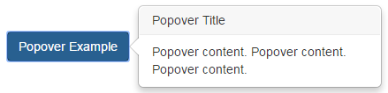
As you can see from the example below, creating a popover is very similar to creating a tooltip.
HTML
<button class="btn btn-primary" id="btnPopover" title="Popover Title"
data-content="Popover content.
Popover content. Popover content."
data-toggle="popover">
Popover Example
</button>
jQuery
$(document).ready(function () {
$('#btnPopover').popover();
});
At the moment to show or hide the popover we have to click on the button. If you want the popover to close when you click anywhere outside the button, use data-trigger="focus"
<button class="btn btn-primary" id="btnPopover" title="Popover Title"
data-content="Popover content.
Popover content. Popover content."
data-toggle="popover"
data-trigger="focus">
Popover Example
</button>
To show or hide the popover on hover use data-trigger="hover"
<button class="btn btn-primary" id="btnPopover" title="Popover Title"
data-content="Popover content.
Popover content. Popover content."
data-toggle="popover"
data-trigger="hover">
Popover Example
</button>
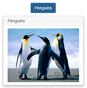
To display an image in popover
<button class="btn btn-primary" id="btnPopover" title="Penguins"
data-content="<img
class='img-responsive' src='Images/Penguins.jpg'>"
data-toggle="popover"
data-html="true"
data-placement="bottom"
data-trigger="hover">
Penguins
</button>
As you can see from the table below, majority of the options, methods and events of the popover plugin are very similar to tooltip plugin.
| popover options | tooltip options |
|---|---|
| placement | placement |
| title | title |
| trigger | trigger |
| animation | animation |
| delay | delay |
| html | html |
| popover methods | tooltip methods |
| popover('show') | tooltip('show') |
| popover('hide') | tooltip('hide') |
| popover('toggle') | tooltip('toggle') |
| popover events | tooltip events |
| show.bs.popover | show.bs.tooltip |
| shown.bs.popover | shown.bs.tooltip |
| hide.bs.popover | hide.bs.tooltip |
| hidden.bs.popover | hidden.bs.tooltip |
No comments:
Post a Comment
It would be great if you can help share these free resources