Suggested Video Tutorials
Part 5 - Bootstrap grid column offset
Part 6 - Bootstrap nested rows and columns
Part 7 - Bootstrap image gallery
In this video we will discuss bootstrap responsive utility classes
What are bootstrap responsive utility classes
Bootstrap responsive utility classes are useful for showing and hiding content by device via media query.
The following are some of the responsive utility classes available in bootstrap 3

Let us now understand the use of these classes with an example. Let us say we have the following 4 columns on a web page.

The following is the HTML I used to produce these 4 columns
Here is the CSS for the customDiv class
Here is what we want to do
1. The column that displays "ALL Screens" must be visible on all screen sizes
2. The column that displays "Medium, Large and Small" must be visible only on medium, large and small screen sizes. It should be hidden on an extra small screen size.
3. The column that displays "Medium and Large" must be visible only on medium and large screen sizes. It should be hidden on small and extra small screen sizes.
4. The column that displays "Large" must be visible only on a large screen size. It should be hidden on all other screen sizes.
This can be very easily achieved by using the responsive utility classes
1. "ALL Screens" column must be visible on all screen sizes, so no change is required here.
2. "Medium, Large and Small" column must be visible only on medium, large and small screen sizes. It should be hidden on an extra small screen size. So applying "hidden-xs" class on this column will hide this column on an extra small device but will be visible across all other devices.
We can also achieve exactly the same thing by using visible-lg, visible-md, and visible-sm classes instead of hidden-xs class. Since with "hidden-xs" we only need to use one class, where as with visible classes we have to use 3 of them, so I have chosen to use hidden-xs.
3. "Medium and Large" column must be visible only on medium and large screen sizes. It should be hidden on small and extra small screen sizes. To achieve this apply visible-lg and visible-md classes on this column.
We can also achieve exactly the same thing by using hidden-sm and hidden-xs classes instead of visible-lg and visible-md classes.
4. "Large" column must be visible only on large screen sizes. It should be hidden on all other screen sizes. To achieve this apply visible-lg class on this column.
As you might have already guessed by now, you can also achieve exactly the same thing by using the hidden classes (hidden-xs hidden-sm and hidden-md), but with this approach you have to use 3 classes, where as with visible classes we have to use only one class (visible-lg)
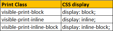
As of bootstrap version 3.2.0, the .visible-*-* classes for each screen size come in three variations, one for each CSS display property value shown below.

The following article explains the difference between display: inline, display: inline-block and display: block
http://stackoverflow.com/questions/8969381/what-is-the-difference-between-display-inline-and-display-inline-block
The following classes also exist, but are deprecated as of v3.2.0.

Similar to the regular responsive classes, you can use the following utility classes to show or hide certain elements for printing purpose
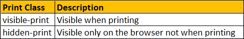
Example : The column that has "hidden-print" class is visible only on the browser and not when printing. The column that has "visible-print" class is visible only during printing and not on the browser.
As of bootstrap version 3.2.0, the visible-print class come in three variations, one for each CSS display property value shown below.
The visible-print class also exists but is deprecated as of bootstrap version 3.2.0.

Part 5 - Bootstrap grid column offset
Part 6 - Bootstrap nested rows and columns
Part 7 - Bootstrap image gallery
In this video we will discuss bootstrap responsive utility classes
What are bootstrap responsive utility classes
Bootstrap responsive utility classes are useful for showing and hiding content by device via media query.
The following are some of the responsive utility classes available in bootstrap 3
Let us now understand the use of these classes with an example. Let us say we have the following 4 columns on a web page.
The following is the HTML I used to produce these 4 columns
<div class="container">
<div class="row">
<div class="col-lg-3
col-md-4 col-sm-6 col-xs-12">
<div class="customDiv">ALL Screens</div>
</div>
<div class="col-lg-3
col-md-4 col-sm-6 col-xs-12">
<div class="customDiv">Medium, Large and Small</div>
</div>
<div class="col-lg-3
col-md-4 col-sm-6 col-xs-12">
<div class="customDiv">Medium and Large </div>
</div>
<div class="col-lg-3
col-md-4 col-sm-6 col-xs-12">
<div class="customDiv">Large</div>
</div>
</div>
</div>
Here is the CSS for the customDiv class
.customDiv{
margin:10px;
min-height:50px;
background-color:silver;
text-align:center;
font-size:large;
padding:10px;
}
Here is what we want to do
1. The column that displays "ALL Screens" must be visible on all screen sizes
2. The column that displays "Medium, Large and Small" must be visible only on medium, large and small screen sizes. It should be hidden on an extra small screen size.
3. The column that displays "Medium and Large" must be visible only on medium and large screen sizes. It should be hidden on small and extra small screen sizes.
4. The column that displays "Large" must be visible only on a large screen size. It should be hidden on all other screen sizes.
This can be very easily achieved by using the responsive utility classes
1. "ALL Screens" column must be visible on all screen sizes, so no change is required here.
2. "Medium, Large and Small" column must be visible only on medium, large and small screen sizes. It should be hidden on an extra small screen size. So applying "hidden-xs" class on this column will hide this column on an extra small device but will be visible across all other devices.
<div class="col-lg-3
col-md-4 col-sm-6 col-xs-12 hidden-xs">
<div class="customDiv">Medium, Large and Small</div>
</div>
We can also achieve exactly the same thing by using visible-lg, visible-md, and visible-sm classes instead of hidden-xs class. Since with "hidden-xs" we only need to use one class, where as with visible classes we have to use 3 of them, so I have chosen to use hidden-xs.
<div class="col-lg-3
col-md-4 col-sm-6 col-xs-12 visible-lg visible-md visible-sm">
<div class="customDiv">Medium, Large and Small</div>
</div>
3. "Medium and Large" column must be visible only on medium and large screen sizes. It should be hidden on small and extra small screen sizes. To achieve this apply visible-lg and visible-md classes on this column.
<div class="col-lg-3
col-md-4 col-sm-6 col-xs-12 visible-lg visible-md">
<div class="customDiv">Medium and Large </div>
</div>
We can also achieve exactly the same thing by using hidden-sm and hidden-xs classes instead of visible-lg and visible-md classes.
<div class="col-lg-3
col-md-4 col-sm-6 col-xs-12 hidden-sm hidden-xs">
<div class="customDiv">Medium and Large </div>
</div>
4. "Large" column must be visible only on large screen sizes. It should be hidden on all other screen sizes. To achieve this apply visible-lg class on this column.
<div class="col-lg-3
col-md-4 col-sm-6 col-xs-12 visible-lg">
<div class="customDiv">Large</div>
</div>
As you might have already guessed by now, you can also achieve exactly the same thing by using the hidden classes (hidden-xs hidden-sm and hidden-md), but with this approach you have to use 3 classes, where as with visible classes we have to use only one class (visible-lg)
<div class="col-lg-3
col-md-4 col-sm-6 col-xs-12 hidden-xs hidden-sm hidden-md">
<div class="customDiv">Large</div>
</div>
As of bootstrap version 3.2.0, the .visible-*-* classes for each screen size come in three variations, one for each CSS display property value shown below.
The following article explains the difference between display: inline, display: inline-block and display: block
http://stackoverflow.com/questions/8969381/what-is-the-difference-between-display-inline-and-display-inline-block
The following classes also exist, but are deprecated as of v3.2.0.
Similar to the regular responsive classes, you can use the following utility classes to show or hide certain elements for printing purpose
Example : The column that has "hidden-print" class is visible only on the browser and not when printing. The column that has "visible-print" class is visible only during printing and not on the browser.
<div class="container">
<div class="row">
<div class="col-xs-12
hidden-print">
<div class="customDiv">Visible on browser NOT when printing</div>
</div>
<div class="col-xs-12
visible-print">
<div class="customDiv">Visible when printing</div>
</div>
</div>
</div>
The visible-print class also exists but is deprecated as of bootstrap version 3.2.0.
Awesome video and instructions!
ReplyDeleteI'm watching a lot of video explain about c# and Asp.net and bootstrap core I see you are the best person who teach that topic thanks a lot for you
ReplyDeletesorry maybe my English is not perfect