Suggested Video Tutorials
Part 33 - Bootstrap labels and badges
Part 34 - Bootstrap progress bars
Part 35 - Bootstrap jumbotron
In this video we will discuss Bootstrap media object
Bootstrap media object is used to place media objects like images, or videos on the left or right hand side aligned with the content such as tweets, comments etc.
To place the media object on the right, use media-right class and place media-right <div> after media-body <div> in the HTML as shown below.
The vertical alignment of media can be top, middle, or bottom. The default is top.
Use media-list class to create a list of media objects or nested media objects. These are useful for comment threads or article lists.

Part 33 - Bootstrap labels and badges
Part 34 - Bootstrap progress bars
Part 35 - Bootstrap jumbotron
In this video we will discuss Bootstrap media object
Bootstrap media object is used to place media objects like images, or videos on the left or right hand side aligned with the content such as tweets, comments etc.
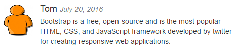
<div class="media">
<div class="media-left">
<a href="#">
<img src="Images/tom.png" class="media-object" alt="tom" />
</a>
</div>
<div class="media-body">
<h4 class="media-heading">Tom <small><i>July 20, 2016</i></small></h4>
<p>
Bootstrap is a free, open-source
and is the most popular HTML,
CSS, and JavaScript framework
developed by twitter for creating
responsive web applications.
</p>
</div>
</div>
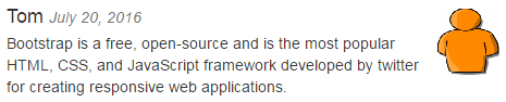
To place the media object on the right, use media-right class and place media-right <div> after media-body <div> in the HTML as shown below.
<div class="media">
<div class="media-body">
<h4 class="media-heading">Tom <small><i>July 20, 2016</i></small></h4>
<p>
Bootstrap is a free, open-source
and is the most popular HTML,
CSS, and JavaScript framework developed
by twitter for creating
responsive web applications.
</p>
</div>
<div class="media-right">
<a href="#">
<img src="Images/tom.png" class="media-object" alt="tom" />
</a>
</div>
</div>
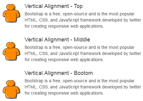
The vertical alignment of media can be top, middle, or bottom. The default is top.
<div class="media">
<div class="media-left">
<a href="#">
<img src="Images/tom.png" class="media-object" alt="tom" />
</a>
</div>
<div class="media-body">
<h4 class="media-heading">Vertical Alignment - Top</h4>
<p>
Bootstrap is a free, open-source
and is the most popular HTML,
CSS, and JavaScript framework
developed by twitter for creating
responsive web applications.
</p>
</div>
</div>
<div class="media">
<div class="media-left
media-middle">
<a href="#">
<img src="Images/tom.png" class="media-object" alt="tom" />
</a>
</div>
<div class="media-body">
<h4 class="media-heading">Vertical Alignment - Middle</h4>
<p>
Bootstrap is a free, open-source
and is the most popular HTML,
CSS, and JavaScript framework
developed by twitter for creating
responsive web applications.
</p>
</div>
</div>
<div class="media">
<div class="media-left
media-bottom">
<a href="#">
<img src="Images/tom.png" class="media-object" alt="tom" />
</a>
</div>
<div class="media-body">
<h4 class="media-heading">Vertical Alignment - Bootom</h4>
<p>
Bootstrap is a free, open-source
and is the most popular HTML,
CSS, and JavaScript framework
developed by twitter for creating
responsive web applications.
</p>
</div>
</div>
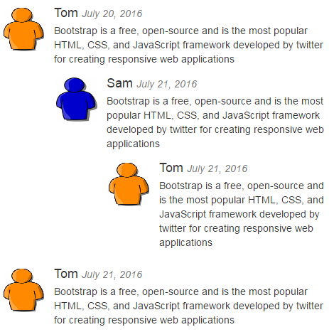
Use media-list class to create a list of media objects or nested media objects. These are useful for comment threads or article lists.
<ul class="media-list">
<li class="media">
<div class="media-left">
<a href="#">
<img src="Images/tom.png" class="media-object" alt="tom">
</a>
</div>
<div class="media-body">
<h4 class="media-heading">Tom <small><i>July 20, 2016</i></small></h4>
<p>
Bootstrap is a free,
open-source and is the most popular HTML,
CSS, and JavaScript
framework developed by twitter for creating
responsive web
applications.
</p>
<!-- First Nested
media object -->
<div class="media">
<div class="media-left">
<a href="#">
<img src="Images/sam.png" class="media-object" alt="sam">
</a>
</div>
<div class="media-body">
<h4 class="media-heading">Sam <small><i>July 21, 2016</i></small></h4>
<p>
Bootstrap is a
free, open-source and is the most popular HTML,
CSS, and
JavaScript framework developed by twitter for creating
responsive web
applications.
</p>
<!-- Another Nested
media object -->
<div class="media">
<div class="media-left">
<a href="#">
<img src="Images/tom.png" class="media-object" alt="tom">
</a>
</div>
<div class="media-body">
<h4 class="media-heading">Tom <small><i>July 21, 2016</i></small></h4>
<p>
Bootstrap is a free, open-source and is the most popular HTML,
CSS,
and JavaScript framework developed by twitter for creating
responsive web applications.
</p>
</div>
</div>
</div>
</div>
</div>
</li>
<li class="media">
<div class="media-left">
<a href="#">
<img src="Images/tom.png" class="media-object" alt="tom">
</a>
</div>
<div class="media-body">
<h4 class="media-heading">Tom <small><i>July 21, 2016</i></small></h4>
<p>
Bootstrap is a free,
open-source and is the most popular HTML,
CSS, and JavaScript
framework developed by twitter for creating
responsive web
applications.
</p>
</div>
</li>
</ul>
No comments:
Post a Comment
It would be great if you can help share these free resources